

|
Getting your Trinity Audio player ready...
|
TL;DR
- Good figures are created through appropriate technical decisions: font size, color use, and line weights. They don’t require super design skills.
- Design at final print size, work in vector format, limit yourself to 1-2 sans-serif fonts, and keep your palette to 5-6 colors.
- Roughly 1 in 12 men has a color vision deficiency, so never let color alone carry meaning. Use dashes, labels, or patterns to indicate a difference, not just color.
Contents
- Main Challenges Researchers Face in Scientific Illustration
- Assemble Requirements and Consult Journal Guidelines
- The Right Typography for Scientific Figures
- Color Palettes Suitable for Print, Screen, and Photocopying
- How to use line weights to make figures more readable
- Layout, Alignment, and White Space
- Accessibility: Designing for Every Reader
- How to choose a scientific illustration tool (cost and expertise required)
- Workflow and File Management
- Frequently Asked Questions
Main Challenges Researchers Face in Scientific Illustration
Most researchers assume that poor figures reflect a lack of design skills. In practice, scientific figures actually have multiple fixable issues: type that shrinks below 5 pt after the journal scales the file, lines that vanish in print, or a rainbow palette that turns to mush in grayscale.
All of these are fixable with rules rather than design k. The sections below cover the parameters that matter most: page layout, typography, color, line weight, layout, and accessibility. Tool selection comes last, because it is the least important decision you will make.
Assemble Requirements and Consult Journal Guidelines
Open your journal’s author guidelines before you open any software. Almost every specification problem is cheaper to prevent than to fix.
- Build the figure at 100% of its final printed width so that type and strokes never need rescaling.
- Single-column figures are usually 80-90 mm wide; double-column figures are usually 170-180 mm wide.
- Keep total height under about 230 mm so the figure and its caption fit on 1 page.
- Choose vector formats (EPS, PDF, SVG, AI) for anything containing text, lines, or shapes.
| Parameter | Typical journal requirement | Why it matters |
| Figure width | 85 mm (1 column) or 170 mm (2 columns) | Prevents downscaling that shrinks text and lines |
| Resolution, line art | 600-1200 ppi | Keeps edges crisp; blurred axes look unprofessional |
| Resolution, photos | 300-600 ppi | Balances detail against file size limits |
| Color mode | RGB for online, CMYK for print | Bright RGB colors shift noticeably in CMYK print |
| File size | Often 10-50 MB per figure | Oversized TIFFs can lead to the submission system hanging as you try to upload them |
The Right Typography for Scientific Figures
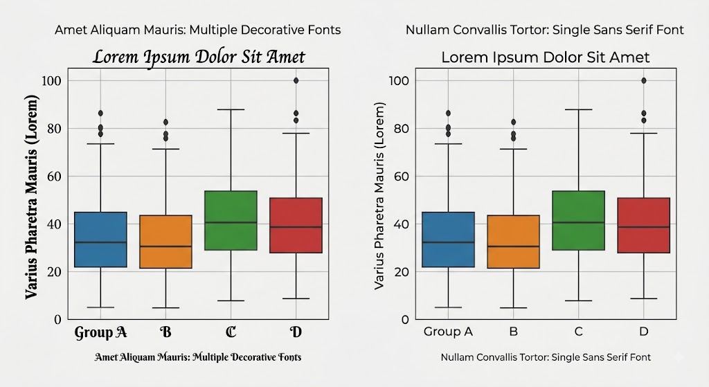
Type is the first thing a reader processes and the first thing that breaks. Be conservative: pick 1 sans-serif family, use 2 or 3 sizes, and never rely on color alone to distinguish labels.
Which is the best font for academic figures?
- Use a sans-serif font family such as Arial, Helvetica, Source Sans, or Calibri; sans-serif type stays legible at small sizes and low resolution.
- Limit yourself to 1 font family per figure and, ideally, the same family across every figure in the manuscript.
- Set gene names, species names, and variables in italics; set units and gene products in roman type.
What font size to use
All sizes below refer to final printed dimensions, not what you see on screen. If you design at 200% and let the journal shrink the file, halve every number here to find out what the reader actually gets.
| Figure element | Size at final width | Practical guidance |
| Panel labels (A, B, C) | 10-12 pt bold | Same corner in every panel, usually top left |
| Axis titles and key labels | 8-10 pt | Spell out units; avoid stacked abbreviations |
| Axis tick numbers | 7-8 pt | Reduce tick density before reducing size |
| Annotations and legends | 6-8 pt | Never go below 5 pt at final size |
| Poster text | 24-32 pt body | Readable from 1-2 m away |
Also keep the following in mind:
- Embed fonts on export, or convert text to outlines, so the typeface does not substitute on the publisher’s system.
- Keep text horizontal (left to right) wherever possible, rotating only the y-axis title.
Color Palettes Suitable for Print, Screen, and Photocopying
Color is what many researchers often get wrong. Don’t use too many in an effort to look visually appealing. Sticking to a palette of 5-6 colors is enough for most figures in a research paper or dissertation.
Types of color palettes
| Palette type | Use it for | Reliable choices |
| Sequential | Ordered data from low to high | Viridis, Cividis, ColorBrewer Blues |
| Diverging | Data with a meaningful midpoint | ColorBrewer RdBu, BrBG |
| Qualitative | Unordered categories and groups | Okabe-Ito 8-color set, ColorBrewer Set2 |
| Avoid | Any continuous data | Rainbow and jet: they create false boundaries |
Applying Color Consistently
- Assign 1 color to 1 meaning and keep it fixed across every figure in the paper: if the control is gray in Figure 1, it stays gray in Figure 4.
- Cap distinct hues at 5-6; beyond that, readers stop matching colors to the legend.
- Convert to CMYK and inspect before submitting to a print journal; vivid greens, oranges, and cyans shift the most.
- Print 1 grayscale copy and check if the figure makes sense.
How to use line weights to make figures more readable
Line weight controls visual hierarchy. When every stroke is the same width, the eye has no route through the figure. Work with 3 tiers: heavy for primary data, medium for structural elements such as axes, and light for grids and guides. Keep the tiers identical between panels.
| Element | Weight at final size | Notes |
| Data lines and traces | 1-1.5 pt | Heaviest element; must dominate the panel |
| Axes and panel borders | 0.75-1 pt | Slightly lighter than the data they frame |
| Tick marks and leaders | 0.5-0.75 pt | Point outward; keep length uniform |
| Grid lines and guides | 0.25-0.5 pt | Light gray; often better removed entirely |
| Absolute minimum | 0.25 pt | Thinner strokes can vanish in offset printing |
Also be sure to:
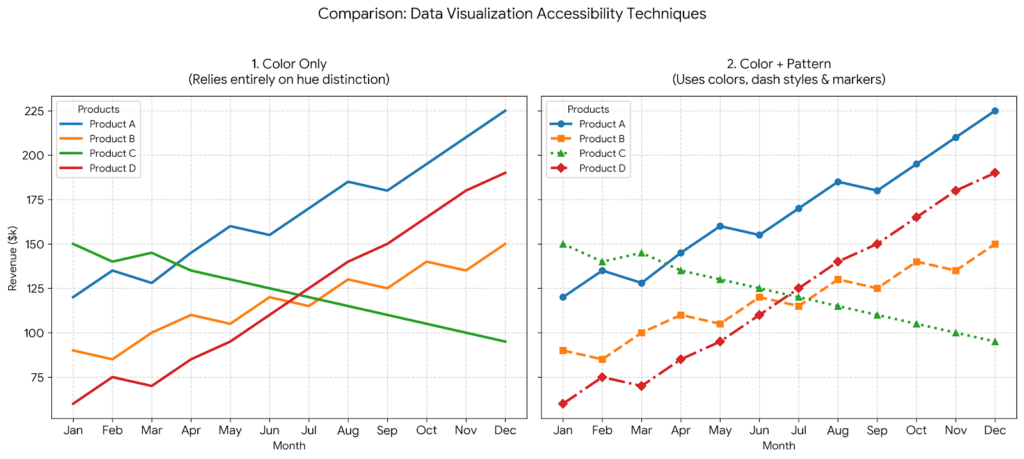
- Distinguish overlapping series by dash pattern as well as color: solid, dashed, and dotted survive grayscale conversion.
- Keep arrowheads proportional: wider than 3 times the stroke weight looks clumsy in print.
Layout, Alignment, and White Space
Misalignment is a common issue in composite figures, and makes the entire image look careless. Take note of the following:
- Align panels on a grid; share baselines, axis origins, and panel widths.
- Place panel labels in the same position, at the same size, in the same weight throughout.
- Leave white space: an uncluttered figure with 4 elements is better a dense one with 12.
Accessibility: Designing for Every Reader
Accessible figures are increasingly a requirement at journals and funders. About 8% of men and 0.5% of women of northern European ancestry have a color vision deficiency, most commonly red-green, and many readers view figures on poor projectors or printouts.
The central principle in making figures accessible is that every distinction that is indicated using color should also be indicated using shape, position, dash pattern, texture, or a direct label.
| Accessibility check | What to do | How to verify |
| Color vision safety | Use Okabe-Ito or Viridis; avoid red-green pairs | Simulate with Color Oracle or Coblis |
| Differences between groups or variables are visible | Add markers, dashes, or direct labels | Convert the figure to grayscale |
| Text contrast | Target a contrast ratio of at least 4.5:1 | Check with a free contrast checker |
| Direct labeling | Label series on the plot, not only in a legend | Cover the legend and reread the figure |
| Alt text | Describe key data points from the graph | Submit with the figure file or caption |
- Never pair red and green to signal opposite meanings.
- Avoid conveying statistical significance through color alone; add asterisks, brackets, or text.
- Make sure your alt-text covers actual insights that a researcher would get from your figure, not just “this is a box and whiskers plot”.
How to choose a scientific illustration tool (cost and expertise required)
Any tool below can produce an acceptable figure. Choose based on what you build most often, your budget, and whether your institution already holds a license.
| Tool | Price (as of August 2026) | Expertise required | Best suited to |
| BioRender | Free tier without publication rights; academic individual plans around $35-39 per month | Low: drag and drop; usable within 1 hour | Life science pathways, mechanisms, and experimental workflows |
| Inkscape | Free and open source | Medium to high: 10-20 hours practice required before you can design figures suitable for publication | Scientific figures across engineering, life sciences, and medicine |
| Mind the Graph | Free tier with watermark; paid plans roughly $10-25 per month | Low: template driven | Graphical abstracts, posters, and infographics |
| Adobe Illustrator | About $23 per month for the single app; student bundles from about $20 per month | High, learning curve is steep. | Professional scientific illustrators working at journals and publishers |
| Canva | Free tier; Pro roughly $15-18 per month; free for verified educators and nonprofits | Low: 1-2 hours | Decorative images rather than research visuals |
Workflow and File Management
Use the following guidelines to ensure that you can easily locate and revise your figures, especially after peer review.
- Keep every figure editable. Always save the source file (.svg, .ai, or the platform project) alongside the exported version.
- Name files systematically, for example Fig02_pathway_v04_2026-08-17.svg.
- Generate plots in R, Python, or GraphPad, then assemble and annotate them in a vector editor.
- Keep a short design specification listing fonts, colors, and line weights, and reuse it across rounds of your paper or chapters of your thesis.
Frequently Asked Questions
What is the best free software for making scientific figures?
Inkscape is the strongest free option across subject areas because it is a full vector editor, reads and writes SVG, EPS, and PDF, and places no restrictions on what you publish. However, its learning curve is moderately steep. Mind the Graph’s free tier is much more exhaustive than BioRender’s and Mind the Graph is both interdisciplinary and beginner friendly.
What font size should I use in a scientific figure for publication?
Aim for 8-10 pt axis titles, 7-8 pt tick numbers, and 10-12 pt bold panel labels, all measured at final printed width. Never use fonts below 5 pt. Always check whether the journal will shrink your figure.
Is BioRender free for graduate students?
BioRender has a free tier, but it caps the number of figures and excludes journal publication rights. Paid academic plans run around $35-39 per month for individuals, with cheaper student options. Check whether your institution holds a subsidized license before paying yourself.
What resolution do journals require for figures?
Most journals ask for 300-600 ppi for photographs and 600-1200 ppi for line art, measured at final printed size. Vector files have no fixed resolution, which is why they are preferred for plots and diagrams.
How do I make my figures colorblind friendly?
Use a color-vision-safe palette such as Okabe-Ito or Viridis, avoid red-green contrasts, and make sure any differences are visually represented through markers, dash patterns, or direct labels. Verify with a simulator such as Color Oracle and then print the figure in greyscale and see if it makes sense.
Should I use RGB or CMYK for journal figures?
Use RGB for online-only journals and presentations, and CMYK when the journal prints in color and asks for it. Convert before submission if required, then inspect the result: saturated greens, oranges, and cyans shift most, so adjust the palette accordingly.
Can I use Canva for scientific figures?
Canva is good for decorative images and social media posts, but it is a general design tool with a small scientific icon library and weak control over exact sizing and vector export. For peer-reviewed data figures, Inkscape or Illustrator gives the control production teams expect.